The U.S. Military Academy's athletics rebranding effort, unveiled Monday, earned acclaim from industry experts, scorn from many Army Times readers, and a bit of both from those at the school, who voiced support at Monday's announcement but took a different stance over anonymous social media.
The new "Athena Shield" logo replaces the image of a Black Knight posing behind a capital "A," which had served as the primary branding mark for Army athletics. A design similar to the new helmet, pulled from the image at the heart of the West Point crest, was a secondary element of previous branding, as was the "kicking mule" design.
Those marks are now "retired," per the official news release. Only the "Classic A" mark, familiar from letterman's jackets, remains as a secondary symbol.
Also, per the release, referring to the athletic teams as "Army" or "West Point" is "incorrect," but "Army" is allowed in some cases, such as "Go Army" and Army-Navy references.
The move helps clarify the academy's identity, officials said.
"West Point's job is to produce leaders of character for the Army," said Col. Ty Seidule, director of the academy's history department and a speaker at Monday's unveiling. "The Army without West Point is not the U.S. Army. West Point without the Army has no mission. To be 'Army West Point' takes away that distinction. 'Are you Army or are you West Point?' 'Yes, we are.' "
One branding expert offered another, more tech-savvy reason for it.
"When you go on social media and you put in 'Army,' the U.S. Army has spent so much money on marketing that West Point has been lost in the mix. You have to differentiate it," said Joe Favorito, a 30-year sports marketing veteran who's worked with pro basketball teams, teaches strategic communications to graduate students at Columbia University and has written a widely used textbook on sports publicity.
Another expert praised the move, but didn't hold out much hope for the public embrace of "Army West Point" as a way to refer to the academy's sports teams.
That's "[p]retty unlikely, if only for length," said James Fox, the CEO of Red Peak Branding a New York City-based design firm that's helped build brands for American Express, Intel and Gannett, parent company of Army Times, according to its online client list. But, Fox added in an email, "whether or not this catches on in the general verbiage of the American public, it's good for the Army that people will now be reminded more often that West Point is part of the larger Army. That, I think, is a win for improving perceptions of the Army itself."
Overall high marks
All three experts who spoke with Army Times had generally positive reviews of the rebranding.
- Fox applauded the linkage of the primary athletics logo with the West Point crest, and said the best audience for the campaign may not be outside the traditional fan base: "I think the biggest win from a branding standpoint is reminding the general public that a highly prestigious school such as West Point is part of the Army. That association can help improve perceptions of the Army as a whole."
- "[T]he entire concept has a very clean, strong, powerful feel to it, especially around the custom typeset," Scibetti said.
- The new look is a minor change in line with the academy's legacy branding, Favorito said, especially when considering major changes made by other schools: "You've seen so many colleges get so far away from their core color scheme for the sake of trying to sell an alternative uniform to the 15 people who may buy it. ... At the end of the day, other than one or two schools, the ones that resonate the most, both in terms of sales and identity, are the ones that stuck with their core."
Reviews from other sources weren't as promising.
A social media storm
Cadets at Monday's ceremony applauded and cheered throughout much of the event. Feedback was more mixed on Yik Yak, a social media application popular on college campuses that allows users to share and vote on anonymous messages.
Some examples:
- New logo ... Fine, it looks decent. Stencil lettering, actually an improvement, represents us better. Classic A, neutral feelings. Army West Point, hell no change that we sound ridiculous.
- "Army West Point: Undefeated since 2015"
- " 'Go Army West Point' sounds like something a cadet's mom who doesn't know a single thing about sports yells at a football game in a drunken stupor."
- "Go Army West Point. Beat Navy Annapolis"
- "Hm. I actually like the new logo. Real talk."
- Most people like the new logo; it's the 'Army West Point but we're also still the Black Knights, Corps and Cadets' that everybody's mad at."
Army Times readers leaned negative on the announcement in their Facebook comments, many supporting the old Black Knight design, others questioning the use of funds on a rebranding effort ... but most appearing more concerned with the on-field results.
"Change that offense and then worry about the uniforms," wrote one commenter.
"Team still sucks so it's all irrelevant," wrote another.

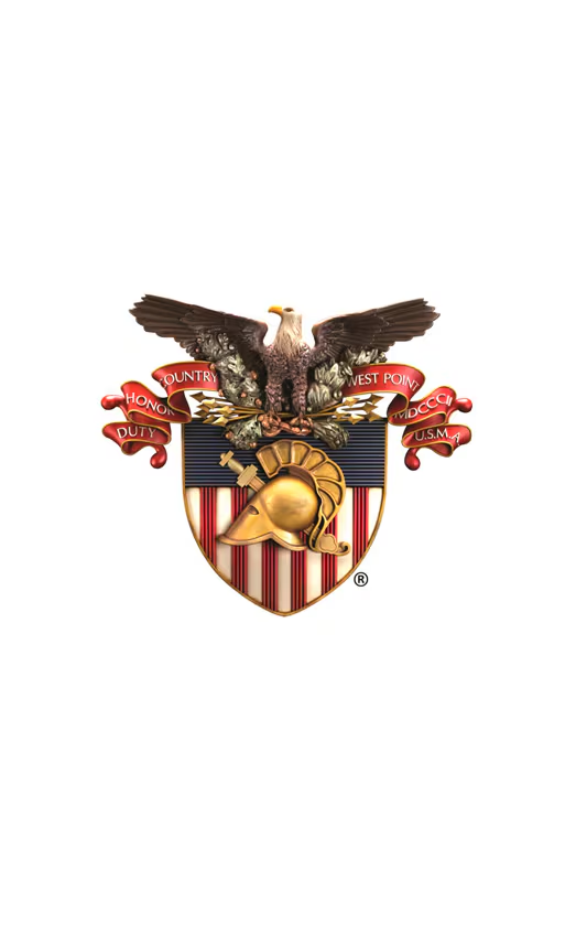
The new logo takes its basic design from the West Point crest.
Photo Credit: Army
There was also debate over one subtle difference between the new logo and the sword/helmet display on the West Point crest.
"That sword is unsheathed there," Seidule, the history professor, said of the new athletics logo, comparing it with the crest. "Here, it's in the sheath. So [in the new logo] it's ready for action, more aggressive."
Some readers pointed out an alternate interpretation.
"The logo appears to be a soldier getting stabbed through the head with a sword (apparently on the ground or in a kneeling position)," Steve English wrote on Army Times' Facebook page. "I'm not sure this represents a victorious mindset if the cadets are supposed to be the guy wearing the helmet."
There's always a middle ground.
"There are some questionable parts, like the sword going through the helmet as looking like defeat before the battle has even started," Red Peak's Fox said, "but if the team performs well it can come to represent ultimate bad-assery — as in, 'so strong that even impaling us through the the head won't stop us.' "
Kevin Lilley is the features editor of Military Times.


